In case you missed it, yesterday I started talking about the process of developing The Victors. We talked about idea generation and visual development. Now it’s on to actually writing the thing!
Step 4: THE SCRIPT
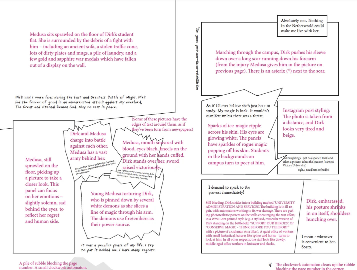
A graphic novel script is broken down into pages, and then panels. Each is considered as a double-page spread, looking at the left and right hand side as a set, and then determining the breakdown of panels on each page.
Here’s two early pages:
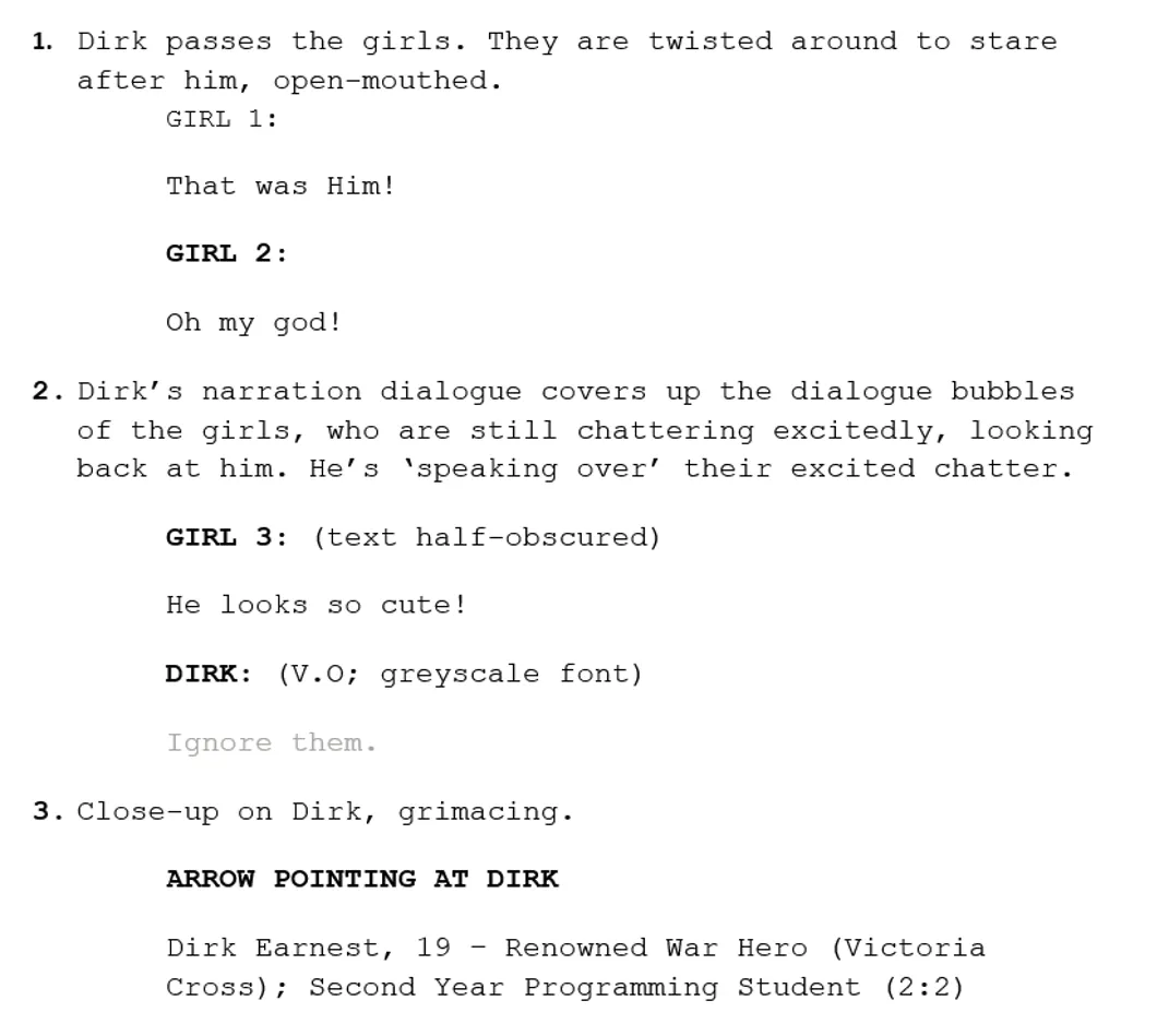
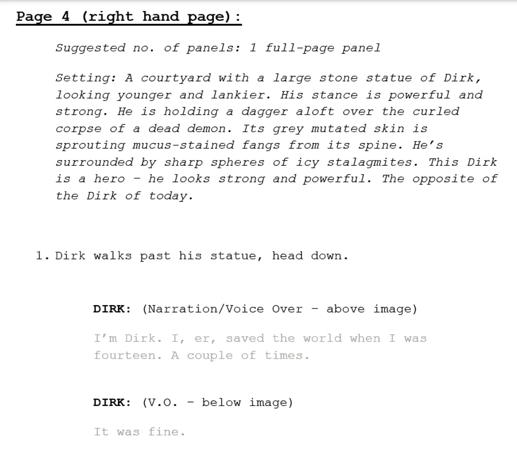
You can see there’s a lot of detail at the top with descriptions, allowing the panel action to be kept clear and distinct for easy reference.
Interestingly, I was given an exact page count for The Victors (225 pages) before I’d even written a word. I had to write to that exact length, which is pretty difficult! You’re also restricted by where the pages fall – chapters always have to begin on the right page, and each double page spread has to feel ‘complete’ – ideally it ends on a scene ending, and the next double page spread takes you to a new location or scene. It’s like a big old puzzle!
It’s very difficult to make a page flow smoothly, without feeling overstuffed with dialogue or with hard-to-follow disjointed action. You also have to pay attention to whether you’re showing action in lots of panels or only a few panels, because that effects the speed at which time passes for the reader, and therefore the tone of the story.
Everything about the process was a new skill I had to learn from scratch! It was incredibly fun and rewarding.
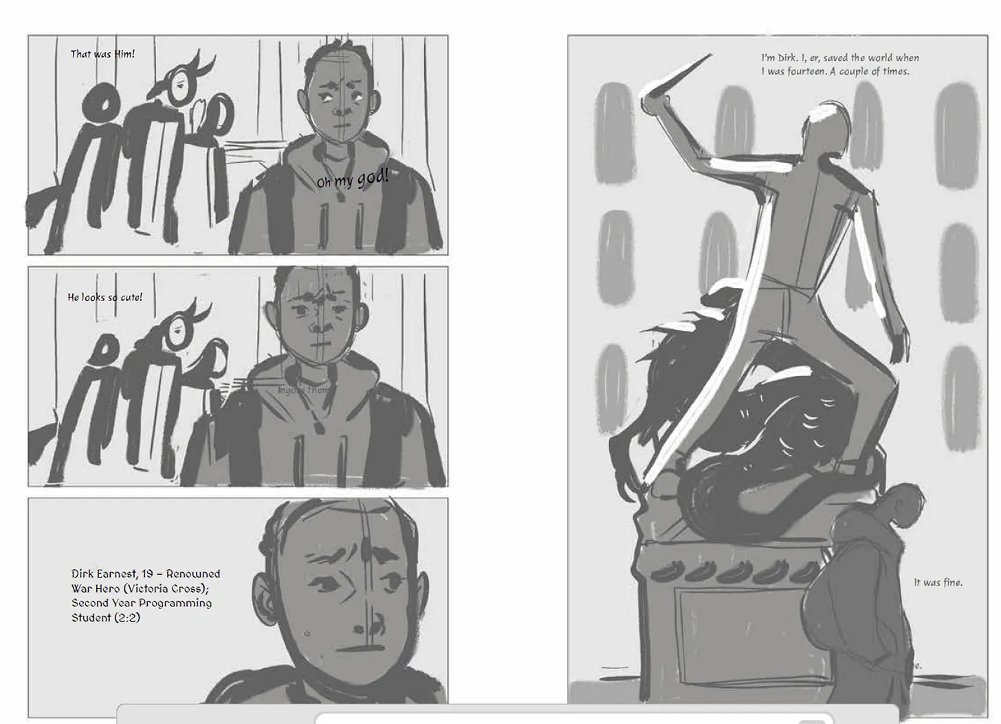
As I was writing, I sketched out these loose panel layouts:
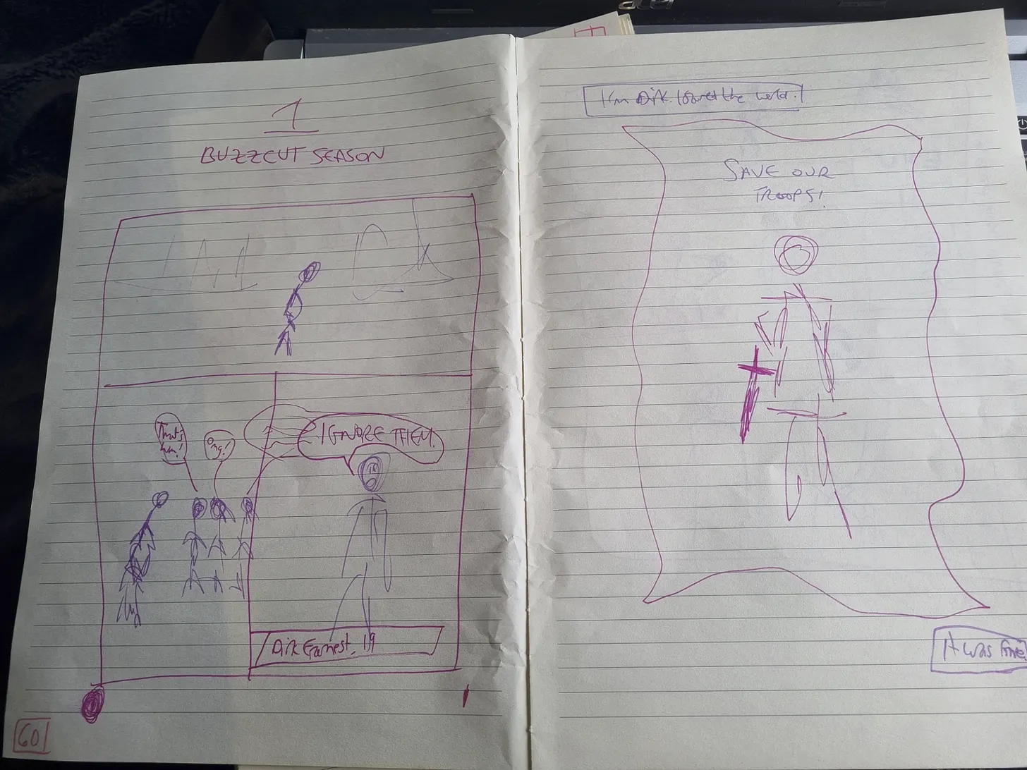
This helped me visualise how messy or sparse each page would be. As you can see, I should really have been allowed to illustrate this myself. 😉
Step 5: LAYOUTS
This then went over to my editor at Walker, Non Pratt. We edited the script until we were happy with the plot (once art is begun, there’s no going back! The script has to be perfect up front.)
Then the designer Jamie made these layouts for every page:
The black text will remain in the final book as dialogue or narration. The pink text is deleted and replaced with Beth’s illustrations. This gives her something to draw into, showing visual sizing and placements for each image, and gives her an idea of how much detail will be possible.
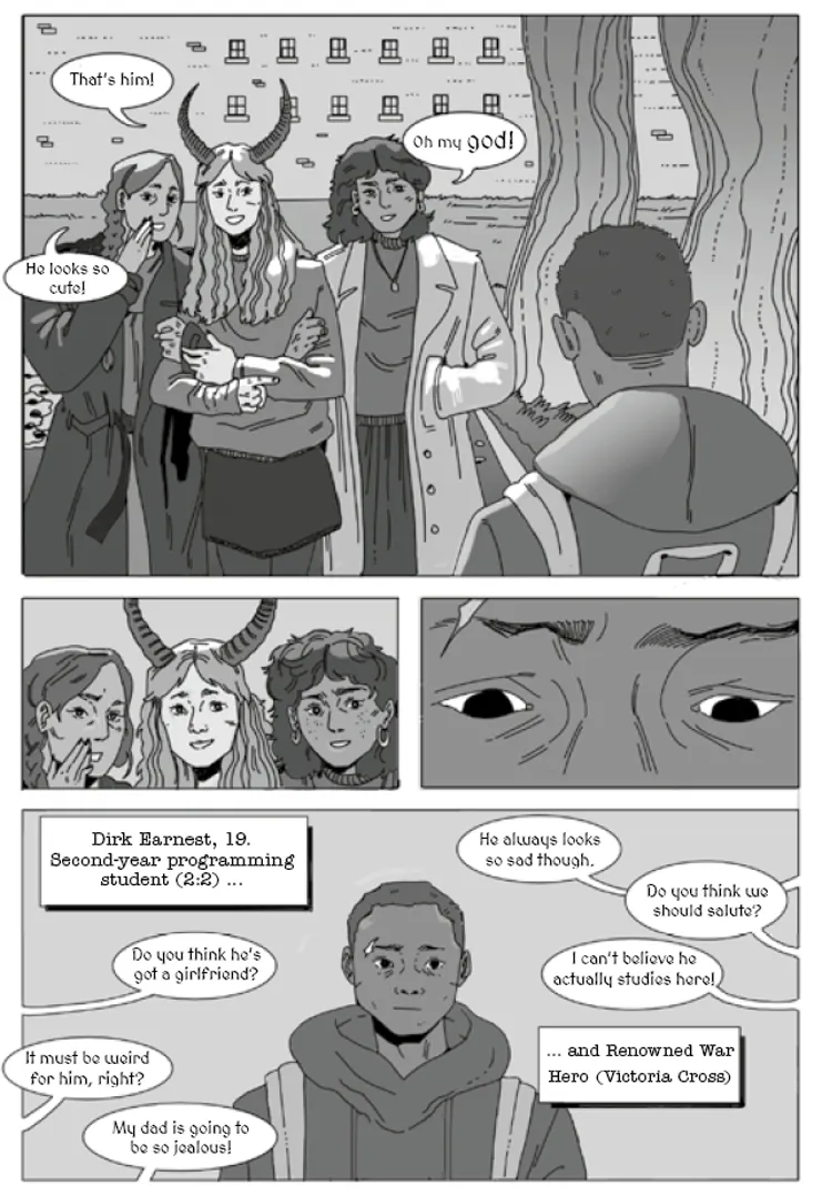
Step 6: BLOCKING
The script and layout is then sent to Beth, and she sketches out a very loose idea of what the art might look like.
As you can see, this is already a bit different from the script sketches. We then give Beth notes, which in this case was to vary the panel shapes and angles on the left page – we’re not getting any new information in each panel on the left, as the view of Dirk is the same. We loved the right page as it stood.
This is a big reason why sketches are done first – so Beth doesn’t waste lots of time adding in loads of detail only to delete it all. This kind of stuff takes more time at the start, when we’re all learning together what we want the pages to look like. Once we’ve got the tone right, it all flows a lot smooth and needs less revision.
Step 7: FINAL ART
Beth revised this sketch to created the final page:
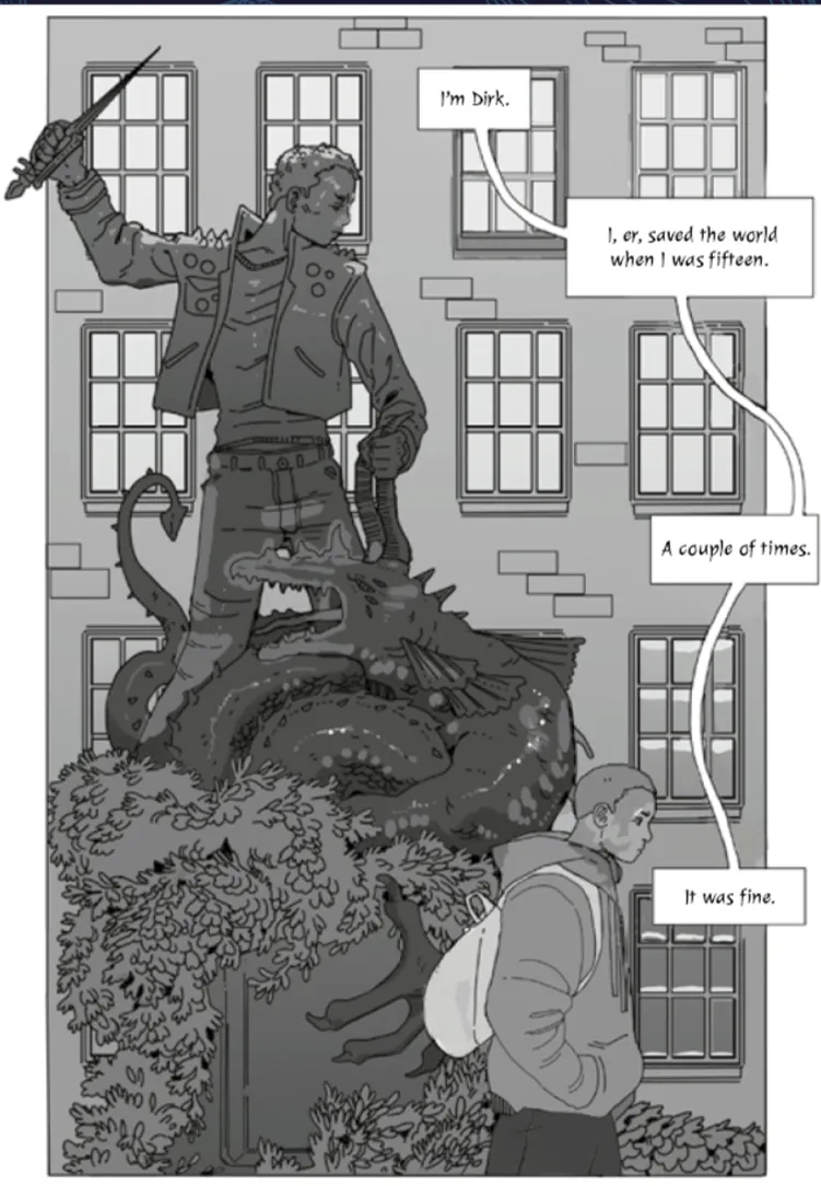
As you can see, we ended up with a very different layout that draws out the reveal of Dirk’s features; did some funky close-ups to add more of a comic book feel; and added in a lot more background chatter on campus. It feels a lot more dynamic and fast-moving in this version, I think. Obviously the gorgeous detail of the art adds a lot too.
We repeat this process 225 times, going over each page many times to make sure everything is consistent (no disappearing mugs or coats or backpacks, etc). And voila! You have a graphic novel!
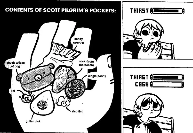
I was inspired hugely from the hundreds of graphic novels I’ve read over the years – not just the amazing Heartstopper but Scott Pilgrim:
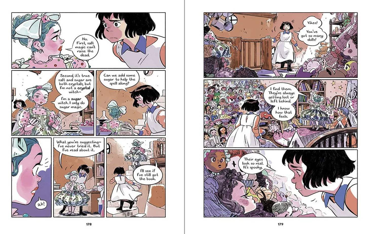
And Salt Magic, among many others:
If you read it, I hope you enjoy it! This post is based on a workshop I give to schools, universities and writing groups. You can find more info here if you’d like me to host something for your network.

The 225-page count constraint before writing a single word sounds both freeing and terrifying in equal measure. Having worked on projects with similar limits, it’s remarkable how those boundaries can actually sharpen creative decisions rather than stifle them.
LikeLike
The 225-page count constraint before writing a single word sounds both freeing and terrifying in equal measure. Having worked on projects with similar limits, it’s remarkable how those boundaries can sharpen the storytelling—especially when every double-page spread has to feel complete. That puzzle-like approach to panel flow and chapter breaks is something I’ll try to borrow for my own drafts.
LikeLike